Posted by: ahamer 12 years, 3 months ago
R & ggplot2 go great together, but the resulting graphs often feel like they could use a makeover. Don't worry - we're here to help!
For the purposes of this tutorial, I'm going to assume you've already got R & ggplot2 installed; if that's not the case, you can get R here and you can install ggplot2 by running the following command once R is installed and open:
install.packages('ggplot2')
Great, once that's all sorted, let's load up ggplot2:
library(ggplot2)
Put this Exam Anxiety data set (Field, 2013) in your working directory, and run the following command to bring the data in as a dataframe:
examData = read.delim('Exam Anxiety.dat', header = TRUE)
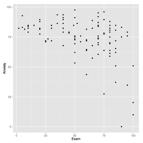
Great! Let's put together a simple scatterplot in ggplot2, comparing self-reported anxiety scores to exam scores:
ggplot(examData, aes(y = Anxiety, x = Exam)) + geom_point()
Let's talk about what's going on in this command before we go further.
The portion before the + tells ggplot what dataframe to use, as well as which columns to use for the axes. You could stop here and have a perfectly valid command, but nothing would get plotted - ggplot2 needs to be told exactly what to do with this data. You can add instructions to ggplot telling it what to do with this data via the + operator. Here, we're telling ggplot that we want it to use points.
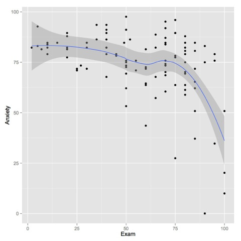
This graph isn't super helpful. Let's add a regression line:
ggplot(examData, aes(y = Anxiety, x = Exam)) + geom_point() + geom_smooth()
See? We add new elements by using the + operator. This simple plotting stuff should be old hat to you by now, so we're going to use gender to group the results, and add some contrasting color & point shapes:
ggplot(examData, aes(y = Anxiety, x = Exam, group = Gender, color = Gender, shape = Gender)) + geom_point() + geom_smooth()
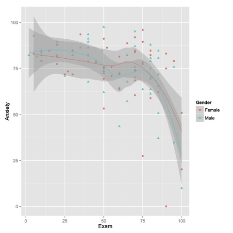
We added the group instructions to the base ggplot command for a few reasons; we can add it to individual commands after that point but we'd have to retype it. Since both geom_point and geom_smooth use the data, it makes sense to centralize it!
I find those confidence regions visually distracting; let's clean up the graph by getting rid of them:
ggplot(examData, aes(y = Anxiety, x = Exam, group = Gender, color = Gender, shape = Gender)) + geom_point() + geom_smooth(se=FALSE)
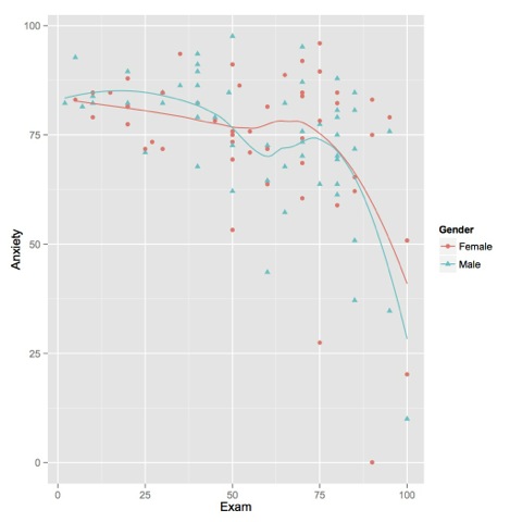
Here, we told the geom_smooth function (which draws that regression line) to ditch the confidence region with the se=false argument.
Let's make those labels more informative:
ggplot(examData, aes(y = Anxiety, x = Exam, group = Gender, color = Gender, shape = Gender)) + geom_point() + geom_smooth(se=FALSE) + ylab('Self-reported anxiety rating') + xlab('Exam score')
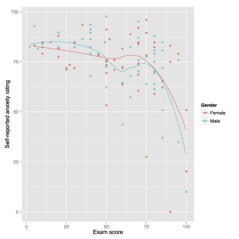
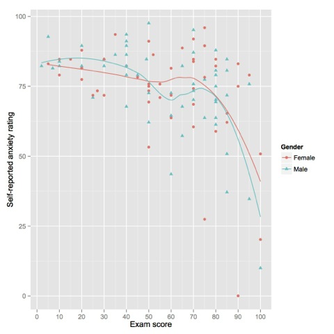
The ylab & xlab let you control the labels for their respective axes. I'm not happy with the scale on the x axis; while I'm fine with quartiles on anxiety ratings I think that exam scores will be easier to analyze if we look at 10 point intervals. Let's make that happen!
ggplot(examData, aes(y = Anxiety, x = Exam, group = Gender, color = Gender, shape = Gender)) + geom_point() + geom_smooth(se=FALSE) + ylab('Self-reported anxiety rating') + scale_x_continuous('Exam score', breaks=seq(0, 100, 10))
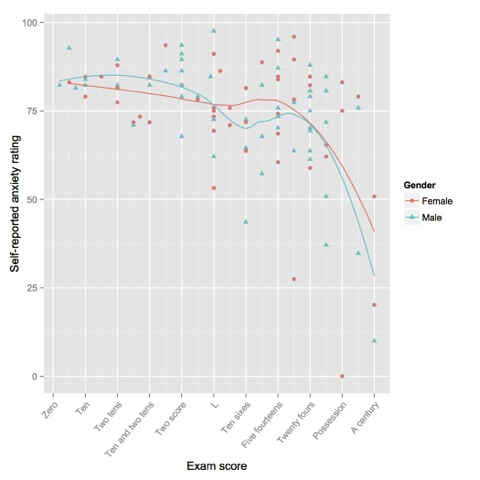
We had to get rid of the xlab command - it's a shortcut for the labeling done in the scale_x_continuous command (and there's a corresponding discrete version). Let's change those x tick labels to something wordier:
ggplot(examData, aes(y = Anxiety, x = Exam, group = Gender, color = Gender, shape = Gender)) + geom_point() + geom_smooth(se=FALSE) + ylab('Self-reported anxiety rating') + scale_x_continuous('Exam score', breaks=seq(0, 100, 10), labels=c('Zero', 'Ten', 'Two tens', 'Ten and two tens', 'Two score', 'L', 'Ten sixes', 'Five fourteens', 'Twenty fours', 'Possession', 'A century'))

Huh. Those labels are really cool, but I'd like to make them slanted so they don't overlap and I can read them!
ggplot(examData, aes(y = Anxiety, x = Exam, group = Gender, color = Gender, shape = Gender)) + geom_point() + geom_smooth(se=FALSE) + ylab('Self-reported anxiety rating') + scale_x_continuous('Exam score', breaks=seq(0, 100, 10), labels=c('Zero', 'Ten', 'Two tens', 'Ten and two tens', 'Two score', 'L', 'Ten sixes', 'Five fourteens', 'Twenty fours', 'Possession', 'A century')) + theme(axis.text.x = element_text(angle = 50, hjust = 1))
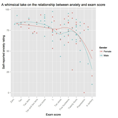
ggplot(examData, aes(y = Anxiety, x = Exam, group = Gender, color = Gender, shape = Gender)) + geom_point() + geom_smooth(se=FALSE) + ylab('Self-reported anxiety rating') + scale_x_continuous('Exam score', breaks=seq(0, 100, 10), labels=c('Zero', 'Ten', 'Two tens', 'Ten and two tens', 'Two score', 'L', 'Ten sixes', 'Five fourteens', 'Twenty fours', 'Possession', 'A century')) + theme(axis.text.x = element_text(angle = 50, hjust = 1)) + labs(title='A whimsical take on the relationship between anxiety and exam score')
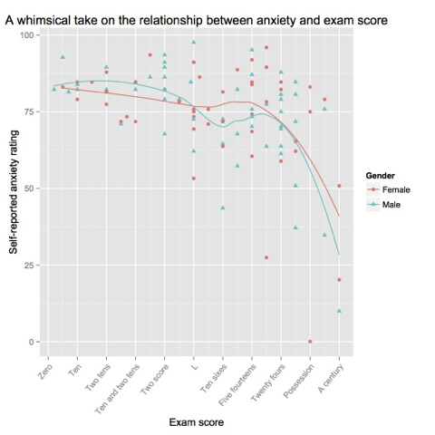
My, that's ugly. Let's give that title a little breathing room.
ggplot(examData, aes(y = Anxiety, x = Exam, group = Gender, color = Gender, shape = Gender)) + geom_point() + geom_smooth(se=FALSE) + ylab('Self-reported anxiety rating') + scale_x_continuous('Exam score', breaks=seq(0, 100, 10), labels=c('Zero', 'Ten', 'Two tens', 'Ten and two tens', 'Two score', 'L', 'Ten sixes', 'Five fourteens', 'Twenty fours', 'Possession', 'A century')) + theme(axis.text.x = element_text(angle = 50, hjust = 1)) + labs(title='A whimsical take on the relationship between anxiety and exam score') + theme(plot.title = element_text(vjust = 1))
I want serifs!
ggplot(examData, aes(y = Anxiety, x = Exam, group = Gender, color = Gender, shape = Gender)) + geom_point() + geom_smooth(se=FALSE) + ylab('Self-reported anxiety rating') + scale_x_continuous('Exam score', breaks=seq(0, 100, 10), labels=c('Zero', 'Ten', 'Two tens', 'Ten and two tens', 'Two score', 'L', 'Ten sixes', 'Five fourteens', 'Twenty fours', 'Possession', 'A century')) + theme(axis.text.x = element_text(angle = 50, hjust = 1)) + labs(title='A whimsical take on the relationship between anxiety and exam score') + theme(plot.title = element_text(vjust = 1)) + theme(text = element_text(family = 'serif'))
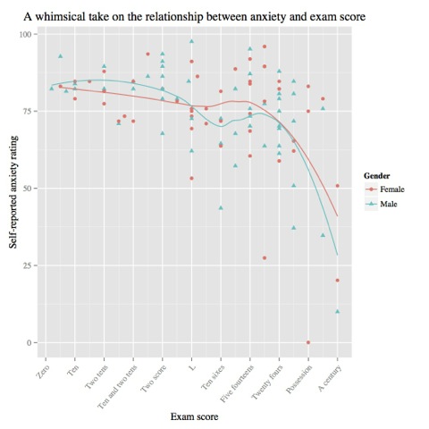
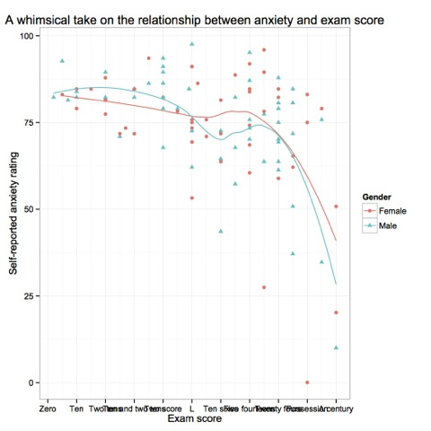
ggplot(examData, aes(y = Anxiety, x = Exam, group = Gender, color = Gender, shape = Gender)) + geom_point() + geom_smooth(se=FALSE) + ylab('Self-reported anxiety rating') + scale_x_continuous('Exam score', breaks=seq(0, 100, 10), labels=c('Zero', 'Ten', 'Two tens', 'Ten and two tens', 'Two score', 'L', 'Ten sixes', 'Five fourteens', 'Twenty fours', 'Possession', 'A century')) + theme(axis.text.x = element_text(angle = 50, hjust = 1)) + labs(title='A whimsical take on the relationship between anxiety and exam score') + theme(plot.title = element_text(vjust = 1)) + theme(text = element_text(family = 'serif')) + theme_bw()
ggplot(examData, aes(y = Anxiety, x = Exam, group = Gender, color = Gender, shape = Gender)) + geom_point() + geom_smooth(se=FALSE) + ylab('Self-reported anxiety rating') + scale_x_continuous('Exam score', breaks=seq(0, 100, 10), labels=c('Zero', 'Ten', 'Two tens', 'Ten and two tens', 'Two score', 'L', 'Ten sixes', 'Five fourteens', 'Twenty fours', 'Possession', 'A century')) + labs(title='A whimsical take on the relationship between anxiety and exam score') + theme_bw() + theme(axis.text.x = element_text(angle = 50, hjust = 1)) + theme(text = element_text(family = 'serif')) + theme(plot.title = element_text(vjust = 1))
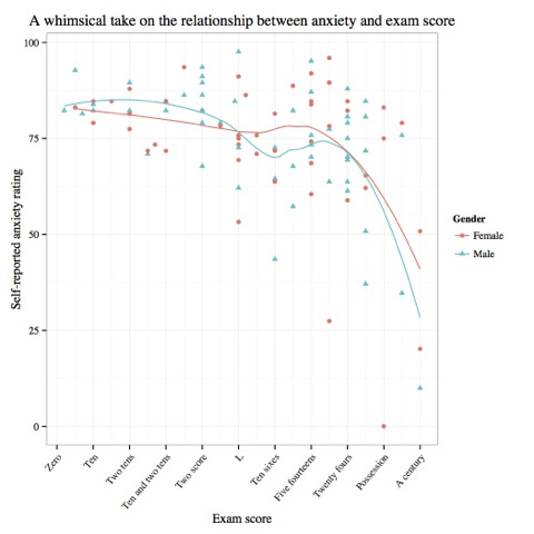
We've messed with a lot of different elements, learned that you can apply formatting anywhere from one object to the entire plot, that there are often a bunch of ways to do the same thing, and also that theming choices are applied in order. Next time, we'll look at box plots, error bars, and pie charts!
References
Field, A. (2013). Exam anxiety [Tab-delimited file]. Retrieved from http://www.sagepub.com/dsur/study/DSUR%20Data%20Files/Chapter%204/Exam%20Anxiety.dat.
Share on Twitter Share on FacebookRecent Posts
- Human-like generalization in a machine through predicate learning
- Back on the wagon
- Focus
- Nintendo didn't attack Zoe Quinn - gamergate did
- Conferencing, candor, and care
Archive
2019
- January (2)
2016
2014
Categories
- lit summary (1)
- meta (1)
- motivation (2)
- networking (1)
- recipes (1)
- research log (2)
- self-evaluation (2)
Authors
- ahamer (10)
Comments
There are currently no comments
New Comment